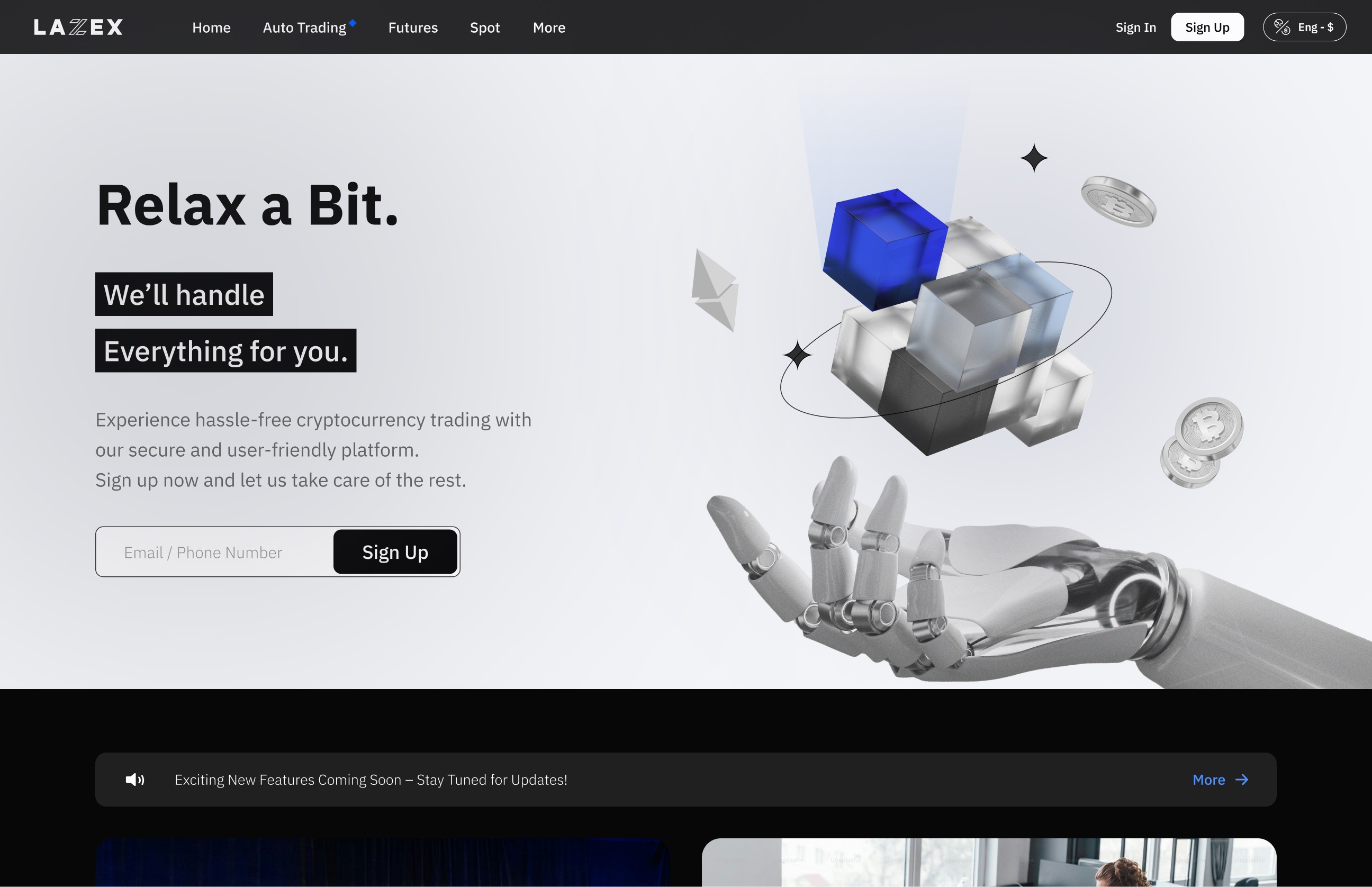
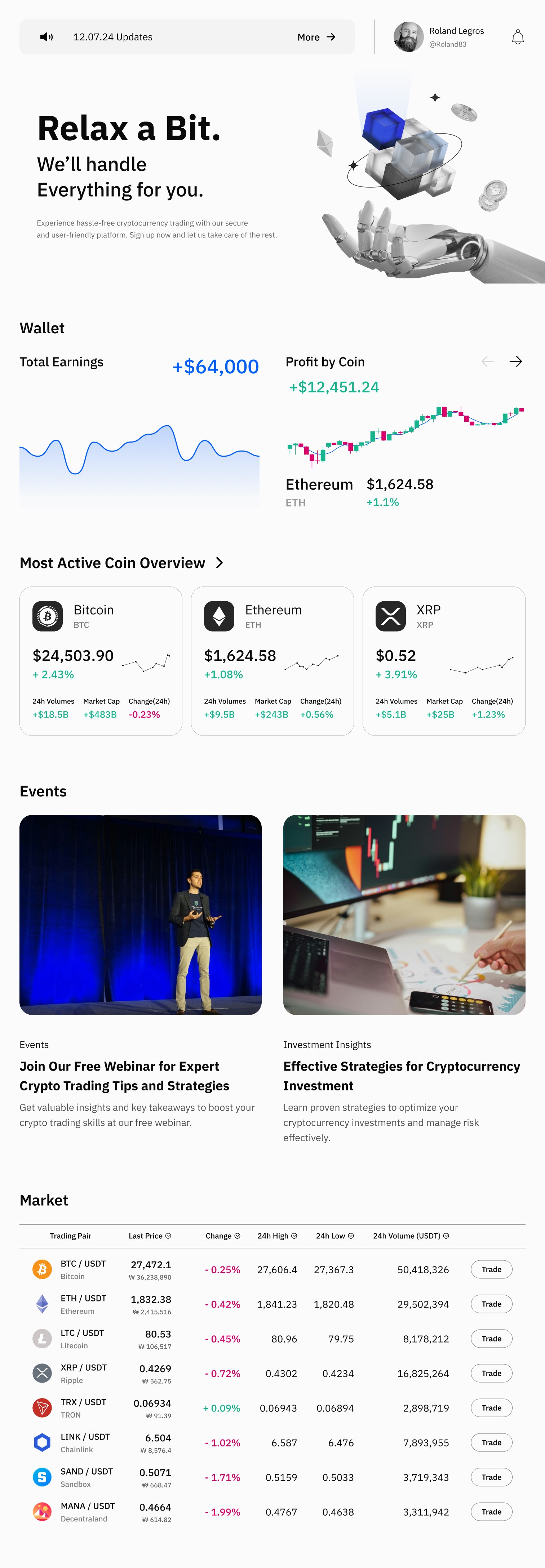
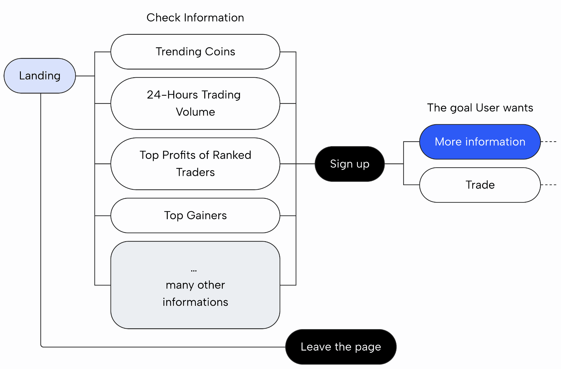
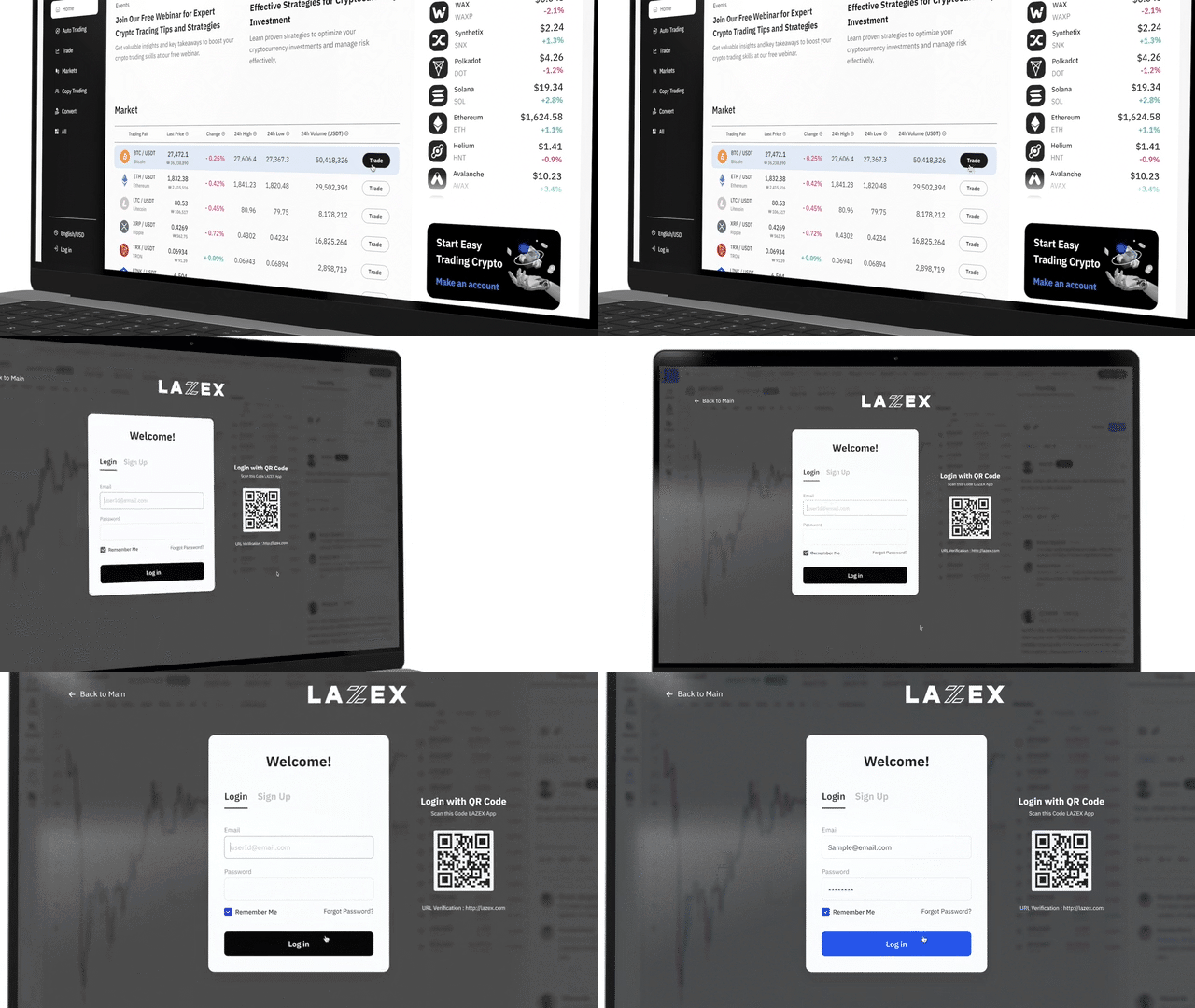
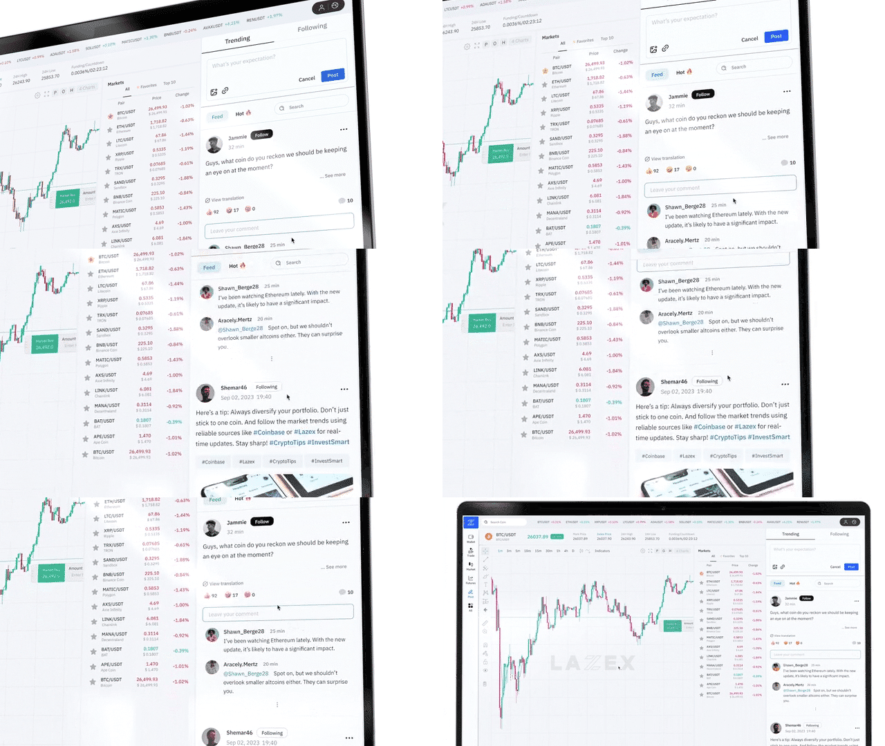
Here’s a quick look at the final design.
I’ll show you the strategy behind this design below.
PROJECT OVERVIEW
At my previous company, We developed a new cryptocurrency trading site with a design similar to other popular platforms. However, the site struggled to gain traction among users. We had no compelling reason to switch from well-established platforms, making it difficult to build trust and attract new users.
KEY ACHIEVEMENTS
Slogan & Image were
not charming enough to Users
ROOT CAUSE ANALYSIS
1
Mismatch between Main UX Design and User Needs
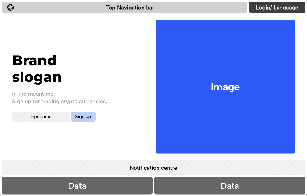
The main part of the website, similar to existing platforms, was dominated by the slogan, sign-up button, and brand image.
Sign-up button was just a heavy door.
So I focused on
DESIGN STRATEGY
1
Engage — Increase User Dwell Time with Valuable Content
Redesign the main page to focus on useful information and content that traders find engaging. Users will naturally spend more time on the site, seeking additional insights.

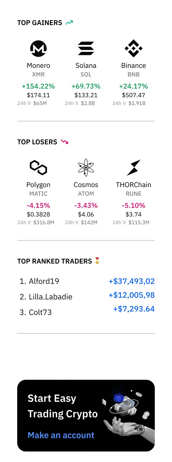
First Informations
Slogan
Image
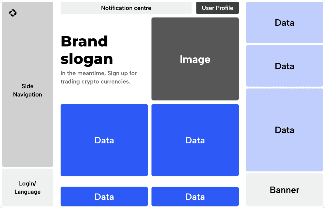
First Informations
Current Prices of Popular coins
24-Hours Trading Volume
Market Cap
Price Change
Top Gainers and losers
Historical Price Data
Top Profits of Ranked Traders
Trending Coins
…
Slogan
Image
If we asked Sign up too early, Users will be like,
'How can I trust them?'
ROOT CAUSE ANALYSIS
2
Lack of Trust
Our site lacked famous investors or influential users to follow. Additionally, as a cryptocurrency exchange, users were more attracted to clear data and positive numbers than to ideas like slogans. It was clear that information would build user trust, rather than images. These findings are grounded in the following four user research studies.
Predicted User Behaviour Flow
Landing
Input their email
Sign up
Leave the page
Insights from User research
Lack of Reliable Information
Users often struggle to trust platforms that don’t provide clear details about their operations, security, and transparency. Over 70% of users consider transparent information crucial when choosing a cryptocurrency platform.
This uncertainty leads many to avoid signing up for new exchanges.
Past Negative Experiences
Negative past experiences, such as losses due to scams or security breaches, make users cautious about trying new platforms.
Recent market volatility and security issues have further eroded trust, contributing to users' reluctance to join new exchanges.
Complex UX/UI and Security Concerns
Some users hesitate to engage with new exchanges due to complex UX/UI and concerns about security. Users often feel overwhelmed by non-intuitive interfaces and are wary of trading in environments where security is not robust, leading to a lack of trust in the platform.
Lack of Educational Resources
Many new users find it difficult to start trading due to a lack of educational resources or beginner guides.
In fact, 40% of users who have not yet started trading stated that they would consider doing so if more educational resources were available.
So first, I want to give
The welcome data drinks
for a brief time to explore
DESIGN STRATEGY
2
Join — Make Sign-up a Natural Step, Not a Heavy Door
Simplify the sign-up process by integrating it seamlessly with the flow of valuable content. Users will feel compelled to register as they explore more features and information.
Predicted User Behaviour Flow
Step 1. Explore
For deeper relationship with Users
I built up the bond
DESIGN STRATEGY
3
Build — Strengthen Relationships and Boost Loyalty
In this project,
What else did I do
Additional Role
1
Design system — Team building
Mentoring
Additional Role
2
Communication with Stakeholder
Achievement & Feedback
Key Achievements
Real feedback from our users
“Before the redesign, it wasn’t anything special, but now I check it regularly, kinda like reading the news. Feels way more trustworthy now.”
— Jun0929
(5 years of trading exp)
“Honestly, I didn’t have a reason to switch exchanges, but I ended up here because of the info. Liked it right from the start.”
— Timyet
(1 years of trading exp)
Key Insights
Building Trust
Users reported that the improved design made the platform feel more trustworthy, increasing their engagement.
Premium Features for Free
Providing high-level features typically reserved for paid versions on other platforms helped differentiate our platform.
Information Management
Users appreciated the depth of information provided but suggested the ability to toggle or customise what they see for a more streamlined experience.
First Impressions Matter
Users noted that the detailed information available was a strong hook, encouraging them to choose our platform over competitors.
